Most 2026 color guides hand you a row of swatches and leave the hardest part to you: how do these colors actually live together — room to room, across a whole house — without turning into a patchwork?
So we designed the whole house. One palette, one cohesive home: bedrooms, bathrooms, dining rooms, and kids' spaces, all built from the same handful of colors. It's a fresh, sporty-heritage scheme, and it answers the question every palette article skips.
The thesis is simple, and it's the thing to take away even if you read nothing else: persimmon is the one-second hook in every room, warm khaki-cream and a grounded olive-green do the structural work on the walls, and cornflower blue is the cool through-line that ties the rooms together. That's the whole trick to bold color that still feels like a home instead of a showroom.
Where this palette comes from
This isn't invented from thin air — it's the overlap of where 2026 color reporting is actually pointing:
- Good Housekeeping 2026 names smoky blue-greens and grounded greens as major designer directions
- Porch Daydreamer's 2026 summary: warm undertones, botanical comfort, earthy browns, verdant greens, and a "red revival" — almost a description of this exact scheme
- Luxe Interiors + Design calls the year grounded palettes with unexpected bursts — which is the olive-and-khaki canvas plus a persimmon pop, exactly
- Brand forecasts from Benjamin Moore (Silhouette), Glidden (Warm Mahogany), and Little Greene pairing adventurous reds with cool blues
Where the headlines keep landing on jade, oxblood, and saffron, this palette takes the road the same reporting supports: a red revival in persimmon, grounded by olive-green and khaki, lifted by clear cornflower blue. It's the sporty, tailored, slightly preppy corner of 2026 color.
The palette (with hex codes)
| Color | Hex | Where it lives |
|---|---|---|
| Persimmon Lacquer | #D04A2B | The hook — one bold object per room: a vanity, a bench, a screen. Never more |
| Cornflower Blue | #7FA7D8 | The cool through-line — banquette, cabinetry, kids' storage, lamps, glassware |
| Olive Sage | #9C9670 | Grounded green on full walls — 2026's "verdant green" direction, warm not minty |
| Universal Khaki | #B7A37F | Warm neutral — grasscloth panels, paneling, rugs, and utility surfaces |
| Cream Enamel | #F4EAD7 | Warm white for trim, ceilings, bedding, and tile fields — keeps everything fresh |
| Black Olive | #242820 | Near-black green-brown for metal beds, window sashes, and graphic outlines |
| Pale Beech | #C99F6B | Light golden wood for floors, nightstands, tables, and vanities |
Notice the ratio. Persimmon and cornflower get all the attention, but olive, khaki, cream, and beech are doing the structural work — that's what keeps the bold notes from screaming.
Dining: where the palette sings
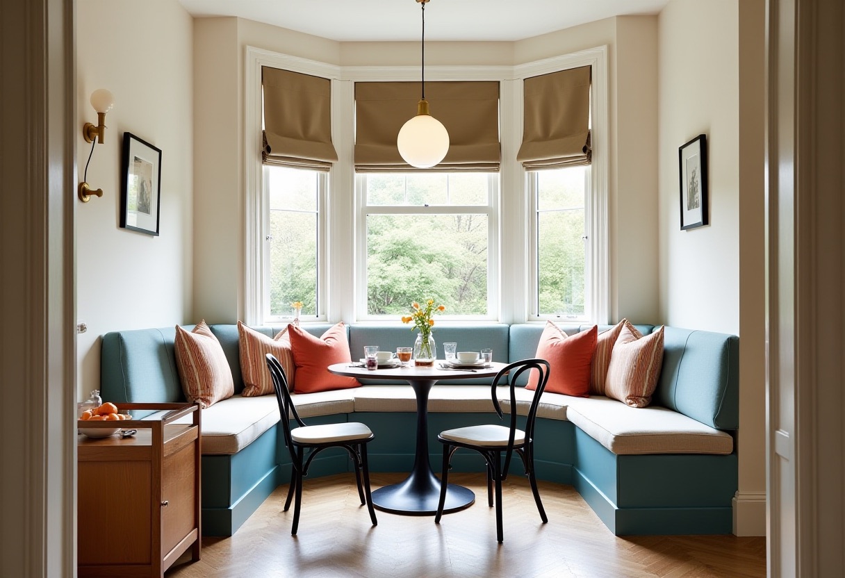
Start here, because this room is the whole palette in one frame. The banquette is cornflower blue, the stripe cushions are persimmon, the table and bentwood chairs are black olive, and cream plaster keeps the bay window airy. It reads as a Parisian café crossed with an American breakfast nook — graphic, but you'd genuinely eat breakfast here every day.
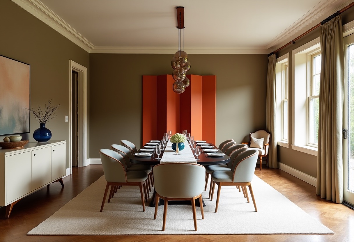
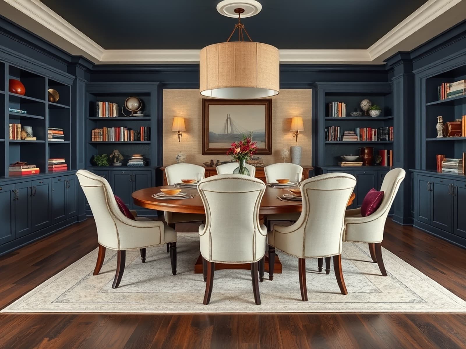
The same palette, dialed up for a more formal room. Here olive-green walls are the calm envelope and a single persimmon folding screen does all the talking — proof that one saturated object beats five. The soft gray chairs keep the room from getting heavy, and a small blue glass vase carries the cornflower note in. This is the grounded, grown-up end of the scheme.
Bathrooms: persimmon as the one-second hook
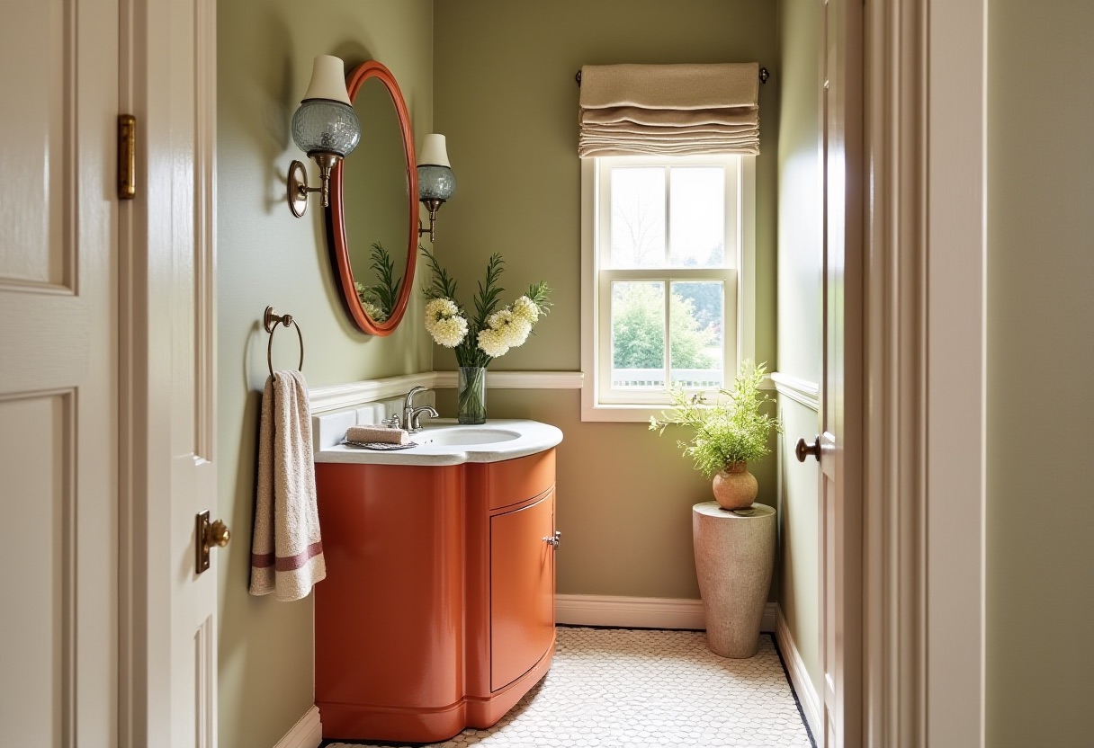
A powder room is the lowest-risk place in the house to be bold, and this is the move: a persimmon lacquer vanity as the focal object against olive-sage walls, with cream wainscoting and an oval mirror to keep it from feeling heavy. Small room, big personality, zero regret.
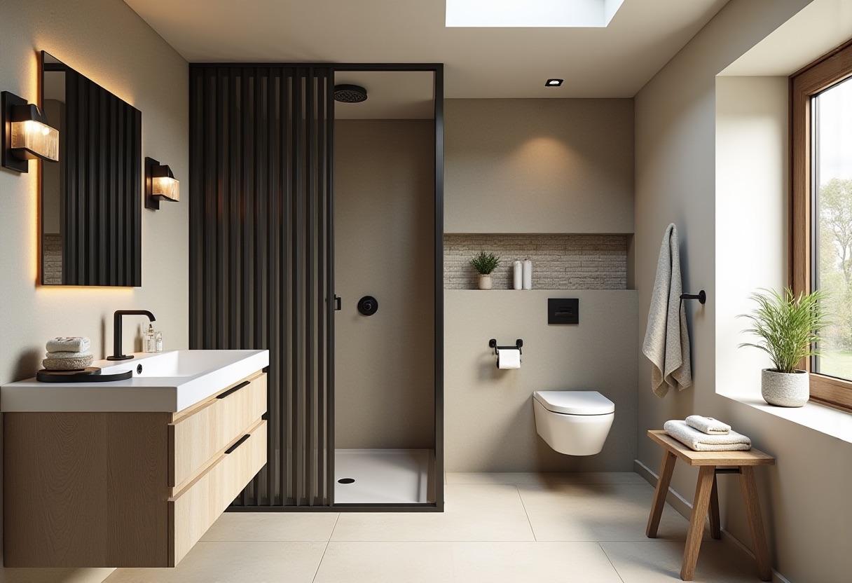
For a full bath, the palette goes quiet and architectural. Warm khaki wraps the room, black-olive slatwork screens the shower and gives the space its structure, and a pale beech floating vanity warms it up. No bold color at all here — and that's the point. Not every room needs the hook; some just need to feel calm and hold the scheme together.
Bedrooms: where bold becomes restful
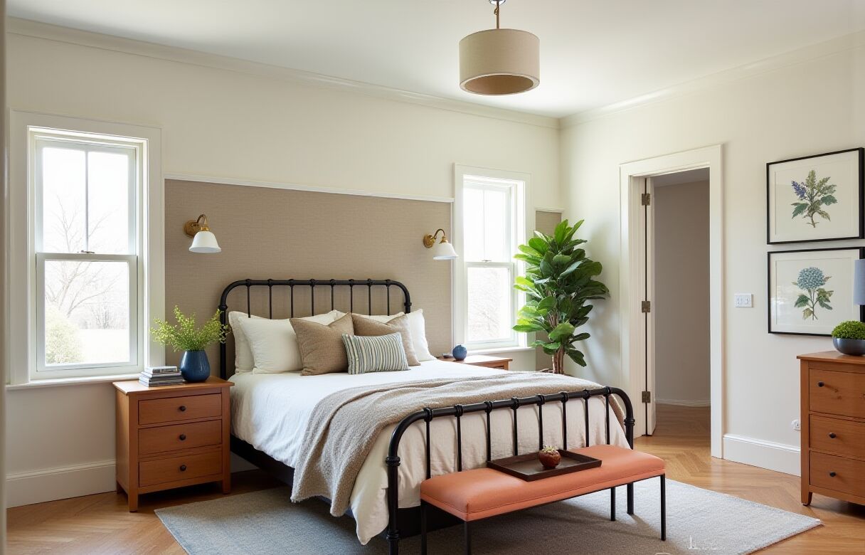
This is how the palette works in a room you actually sleep in. A khaki grasscloth panel anchors the wall, the black-olive campaign bed draws the lines, and the color shows up exactly where it should: a persimmon bench at the foot, cornflower-blue vases, a blue table lamp, and a single blue-striped pillow. The walls stay cream and calm — bold color, restful room.
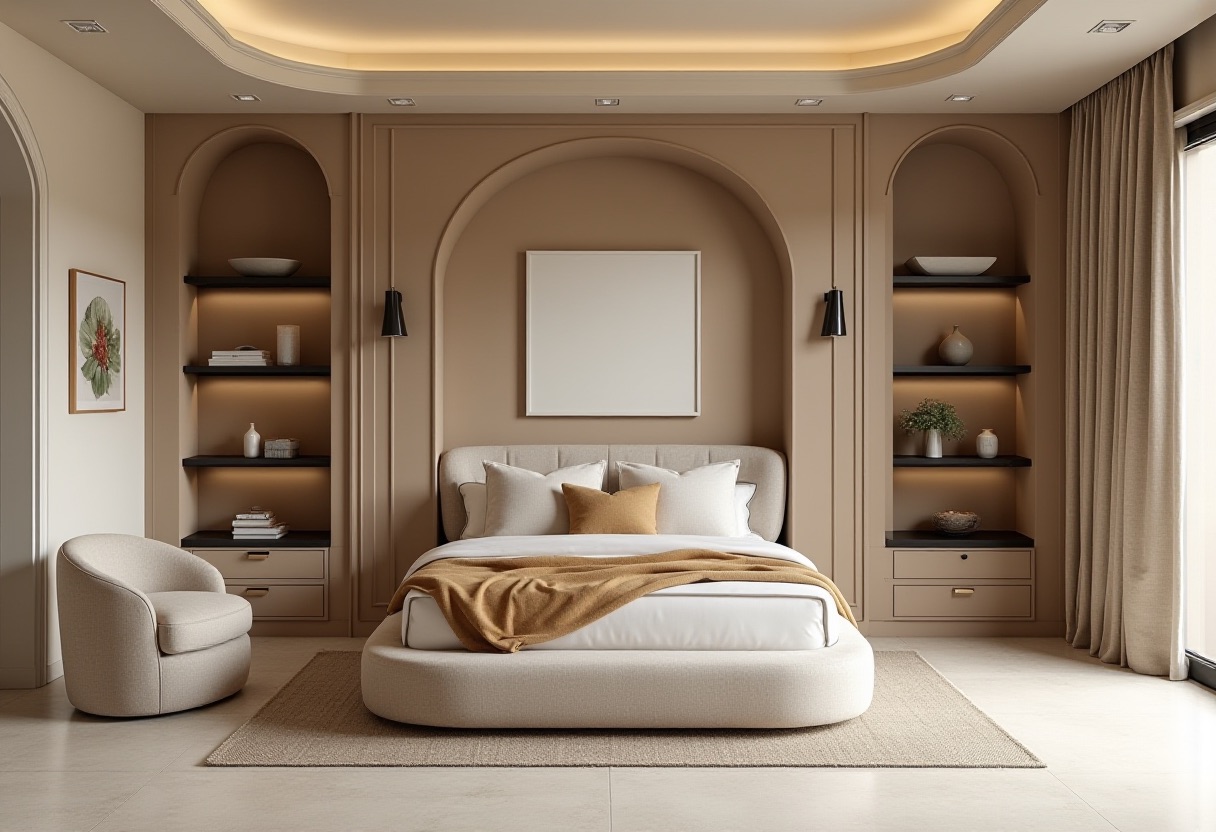
And here's the room where the palette deliberately rests. Warm khaki plaster, arched niches, a low curved bed, a caramel throw — almost all neutrals, soft Italian-modern. A whole-home scheme needs rooms like this: places where the eye relaxes between the bolder spaces. It's still the same family of warm khaki, cream, and beech — just turned all the way down.
Kids' rooms: durable color that grows up
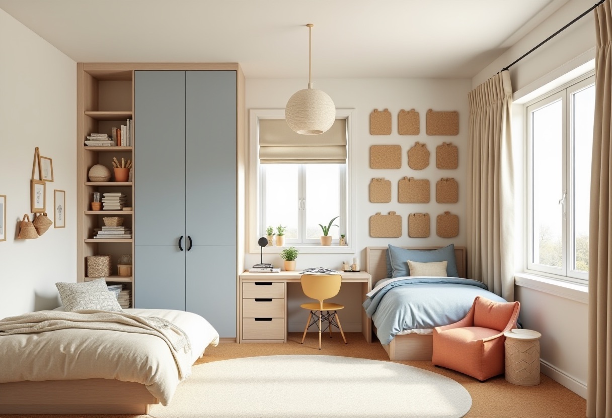
This is why cornflower is a smart kids' color: it's calm, washable, and it isn't a cartoon theme they'll outgrow in two years. The cornflower-blue storage is durable and clear, the persimmon seat is the kid-friendly focal point, and the homework zone stays tidy and grown-up. No loft, no bunk, no primary-color daycare look.
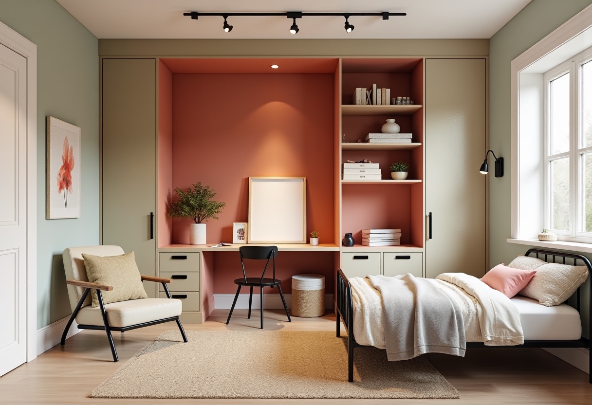
The teen version proves the palette ages up. Soft sage-green walls make it feel older, the persimmon art niche gives them a creative zone, and the black-olive metal bed keeps the lines crisp. Same family of colors, a completely different stage of life — which is exactly what a whole-home palette is supposed to do.
The one rule that makes it work
Across all of these rooms, one discipline repeats: persimmon never covers more than one object. A vanity. A bench. A screen. A stripe of cushions. The moment persimmon shows up on two big surfaces in the same room, the contrast tips from "designed" to "loud."
Everything else follows from that:
- Pick your through-line and commit. Here it's cornflower blue, returning across the house — banquette, cabinetry, kids' storage, glassware — so the home feels like one home.
- Let neutrals carry the walls. Olive, khaki, and cream do the vast majority of the surface area. That's what makes the bold colors look intentional instead of accidental.
- Spend your one bold move where it's safest. Powder rooms, a single piece of furniture, a screen. Low square footage, high impact.
This palette is for you if: you've moved past gray-and-greige, you want color that's cheerful without being childish, and you like the idea of a home that feels collected and connected rather than a series of unrelated Pinterest boards.
See your own room in this palette
The hardest part of any color scheme isn't the swatches — it's picturing it on your walls, with your furniture and light. That's exactly what Neat Pilot does. Snap a photo of your bedroom, bath, dining room, or kid's room, and our AI redesigns it in the palette and style you choose — persimmon, cornflower, and olive included — so you can see the finished room before you buy a single sample pot.
Try it free on your own room → and watch the "before" become a 2026 "after" in seconds.
Every room above was designed and rendered by Neat Pilot's AI from a single 2026 color palette — no real listing photos, just a preview of what's possible in a real home.