If you've been scrolling Pinterest, Architectural Digest, or any paint brand's "2026 forecast" article lately, you already know: cool gray is over. The headlines and the launches all agree on it. What they don't always agree on is what's replacing it.
So we did the legwork. We pulled together the 2026 color reporting from Architectural Digest, ELLE Decor, LUXE Interiors + Design, Vogue, HGTV Home by Sherwin-Williams, Benjamin Moore Color Trends 2026, Sherwin-Williams Colormix 2026, Dunn-Edwards A Quiet Joy, Dutch Boy, Graham & Brown, Valspar, Behr, Etsy, Pantone, and Glidden — and let the overlap tell the story. Four distinct palettes keep showing up across that coverage. Together they cover the whole 2026 color conversation: the warm earths, the tailored umbers, the garden greens, and the soft lavender-with-mahogany direction.
Below: each palette with its source citations, full hex codes, and real bedrooms, bathrooms, dining rooms, and kids' rooms designed in it — so you can see exactly how the colors live before you buy a single sample pot.
Palette 1: Patina Khaki & Damson Hearth
The headline: A heritage-modern palette built around Sherwin-Williams' 2026 Color of the Year, Universal Khaki (SW 6150) — paired with aged blue-green, smoky plum, and warm ochre. ELLE Decor and HGTV Home by Sherwin-Williams both point to this direction: nature-inspired warmth, layered elegance, and a clear break from the gray-and-greige decade.
Sources behind it:
- Sherwin-Williams 2026 Color of the Year: Universal Khaki SW 6150, described as nature-inspired warmth, timeless functionality, and layered elegance
- ELLE Decor 2026 paint reporting: Etsy Patina Blue, Valspar Warm Eucalyptus, Graham & Brown Divine Damson, warm ochres, restorative hues
- HGTV Home by Sherwin-Williams 2026: Griffin, Cordovan, and Universal Khaki paired with natural finishes
The colors:
| Color | Hex | Where it lives |
|---|---|---|
| Universal Khaki | #B8AA8F | Midtone warm khaki-taupe — the primary wall neutral |
| Patina Blue | #5F9EA0 | Aged copper blue-green — vanities, kids' rooms, textiles |
| Warm Eucalyptus | #7D927E | Restorative muted sage with gray-olive depth |
| Divine Damson | #6E3F58 | Smoky plum-burgundy — heritage-depth accent walls |
| Melodious Ivory | #F1E6D2 | Creamy ivory with parchment warmth — trim and bedding |
| Sunbaked Ochre | #C48645 | Soft clay-gold — handmade warmth in kids' spaces |
| Cordovan Brown | #6B4632 | Rich leather brown — grounding tone for millwork |
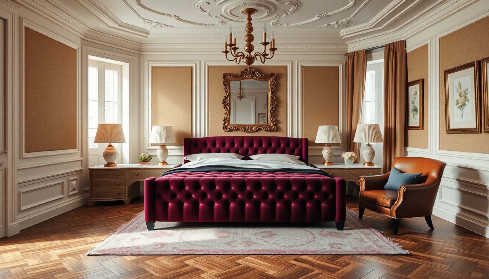
The Damson plum is the showstopper here, but notice how restrained it is — used as a heritage-depth accent on the bed and drapery rather than slathered on every wall. That's the trick to making this palette livable: Universal Khaki carries the room, and Damson, Patina Blue, and Ochre rotate in as room-specific personality.
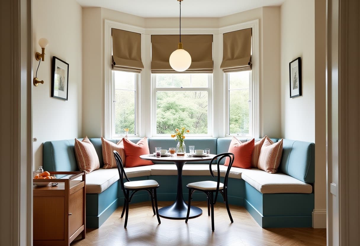
Patina Blue does heavy lifting in coastal-leaning rooms. It reads as both vintage and current — a deliberate move away from the navy-and-white coastal palette that dominated 2018–2023.
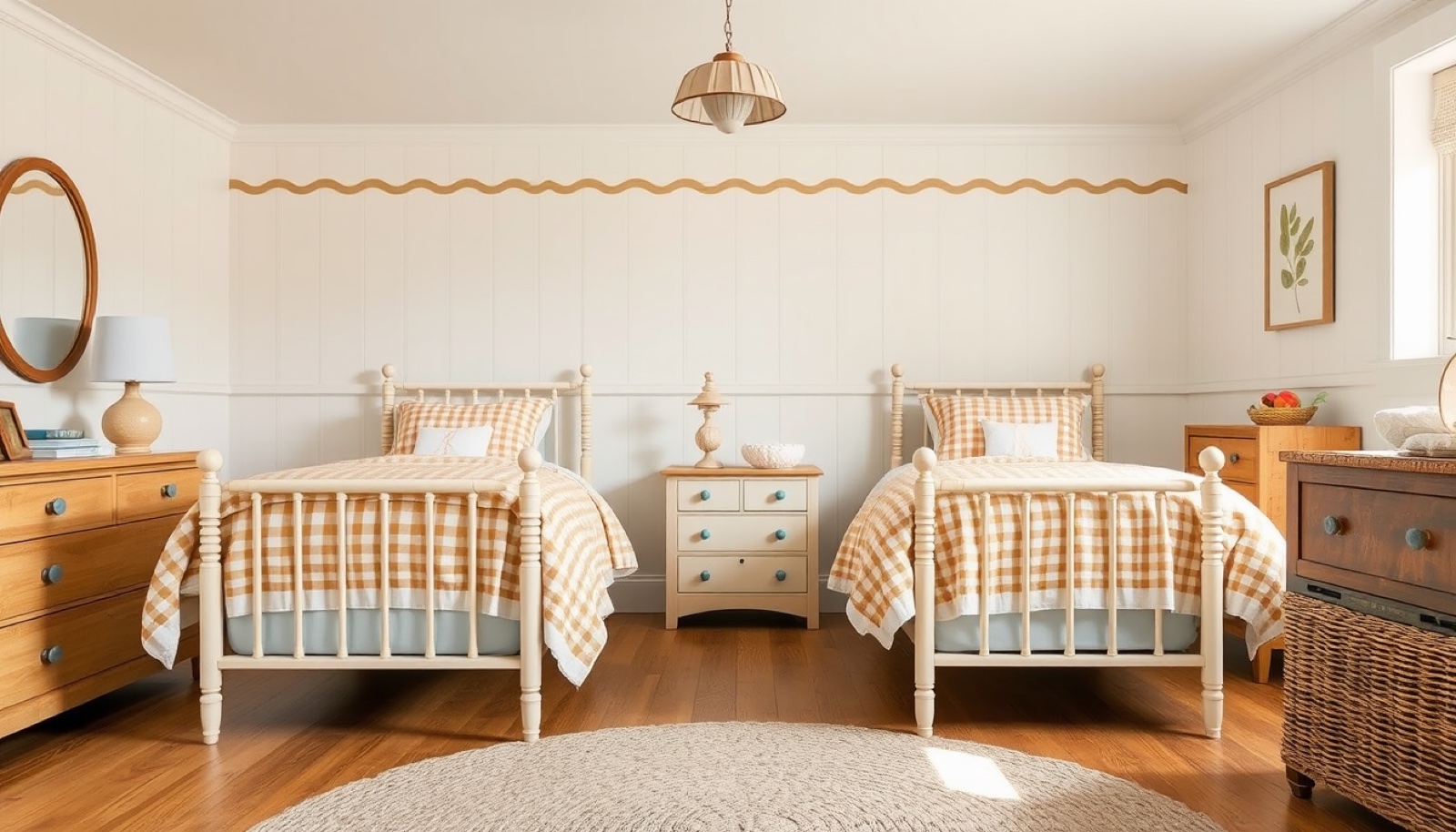
Sunbaked Ochre in a kids' room — a 2026 way to do "warm and playful" without the primary-color daycare look. The same palette adapts from grown-up bedroom to children's space by shifting which color leads.
This palette is for you if: You want the warmest, most layered direction in 2026. Heritage-feeling, lived-in, photographs beautifully in dim winter light, and gives you a clear story to commit to across the whole house.
Palette 2: Tailored Umber, Raindance & Soft Pottery
The headline: Built around Benjamin Moore Color Trends 2026 with Silhouette AF-655 as the lead — a burnt umber with soft charcoal depth. Architectural Digest and Vogue both call out umber and earthy mid-tones as the direct replacement for "sad beige." It's the most tailored, most architecturally serious of the four palettes.
Sources behind it:
- Benjamin Moore Color Trends 2026 with Silhouette AF-655 as the anchor, supported by Raindance, First Crush, Swiss Coffee, Batik, Narragansett Green, Southwest Pottery, and Sherwood Tan
- Architectural Digest 2026 reporting on warm natural hues including espresso-charcoal Silhouette
- Vogue 2026 interior reporting calls out earthy umber and pistachio-chartreuse as alternatives to sad beige, with warm muddy neutrals anchoring rooms
The colors:
| Color | Hex | Where it lives |
|---|---|---|
| Silhouette | #5A4B46 | Tailored burnt umber — millwork, focal walls, cabinetry |
| Raindance | #A8B6AD | Misty gray-green blue — calm on walls and cabinets |
| Swiss Coffee | #F3EEE3 | Warm creamy white — trim, ceilings, tile, bedding |
| First Crush | #F1D3CF | Barely-blushed shell pink — human, not sugary |
| Batik | #8B6D68 | Muted rosy clay-mauve — textile warmth |
| Narragansett Green | #2E4944 | Deep blue-green — tailored architectural depth |
| Southwest Pottery | #A35F43 | Sun-fired terracotta clay — earthy accent |
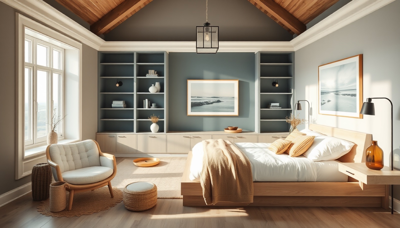
This is what "tailored 2026" looks like in a bedroom. Silhouette grounds the room — millwork, headboard, possibly even the ceiling beam — while Swiss Coffee keeps the walls and bedding feeling fresh. Raindance and First Crush add the softness, so the room never tips into "men's club."
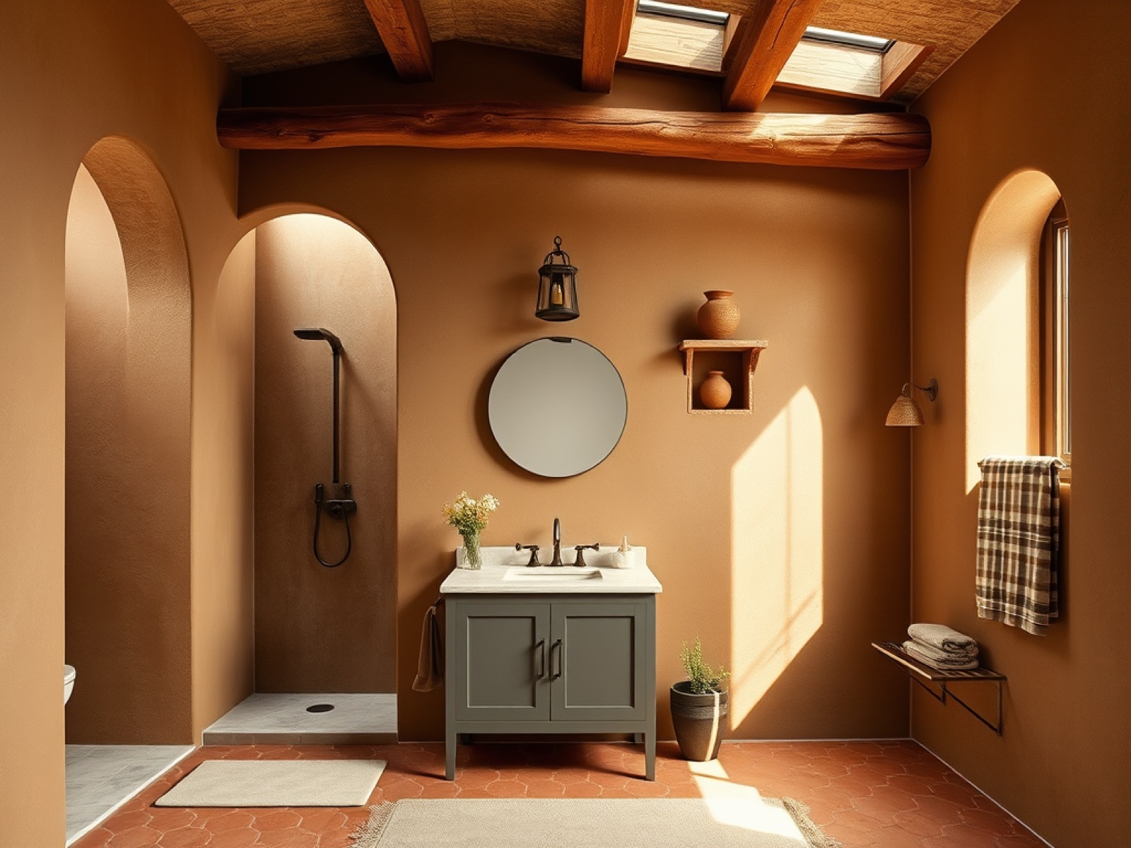
Southwest Pottery is the sleeper hit of Benjamin Moore's 2026 palette. In a bathroom, it reads like sun on clay — and it pairs naturally with Raindance for the vanity and Swiss Coffee for the plaster. This is one of those palettes you didn't know you wanted until you saw it.
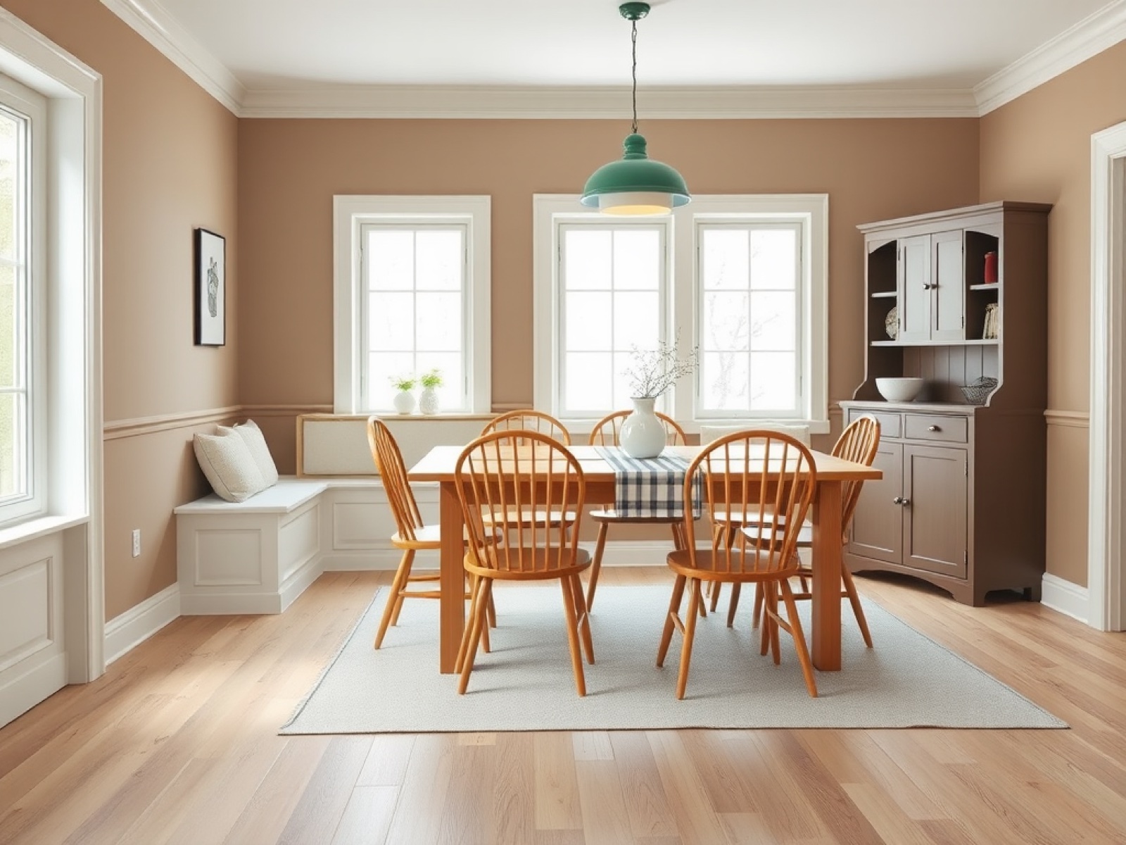
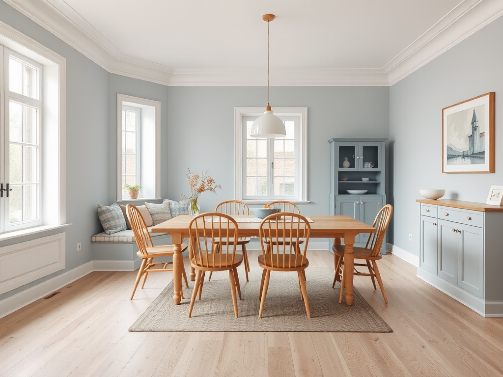
First Crush in a breakfast room — a Vogue-approved way to do pink in 2026. Not Millennial Pink, not Barbiecore. A soft mineral pink that reads grown-up and Scandinavian, especially against pale oak and Swiss Coffee trim.
This palette is for you if: You want the most tailored, most editorial direction in 2026. Looks expensive immediately, plays well with both modern and traditional architecture, and gives you a clear lead color (Silhouette) without forcing you into a "moody" mood.
Palette 3: Patina Garden, Ivory & Chardonnay
The headline: A green-led palette anchored by Dunn-Edwards' 2026 A Quiet Joy collection and Midnight Garden as its lead — supported by Etsy Patina Blue, Warm Eucalyptus, Sonoma Chardonnay, and Divine Damson. ELLE Decor and Architectural Digest both flag this garden-washed direction as one of the strongest 2026 stories: aged, restorative, colorful without being loud.
Sources behind it:
- Dunn-Edwards 2026 Color Trends / A Quiet Joy centered on Midnight Garden, with green-led supporting tones including Country Air, Gypsum Rose, Cedar Grove, Sonoma Chardonnay, Antique Coin, and Purple Prose
- ELLE Decor 2026 paint reporting: Etsy Patina Blue, Behr Hidden Gem, Valspar Warm Eucalyptus, Graham & Brown Divine Damson, and Dutch Boy Melodious Ivory as livable color directions
- Architectural Digest 2026 color signals: Behr Hidden Gem, Sherwin-Williams Universal Khaki, Pantone Cloud Dancer, Divine Damson
The colors:
| Color | Hex | Where it lives |
|---|---|---|
| Patina Blue | #5E8F8D | Aged copper blue-green — cabinets, vanities, textiles |
| Melodious Ivory | #F1E6D0 | Soft creamy ivory — trim, ceilings, plaster, bedding |
| Warm Eucalyptus | #8FA686 | Restorative muted green — calm bedroom walls |
| Midnight Garden | #1F3F34 | Deep botanical green — dramatic millwork, focal walls |
| Sonoma Chardonnay | #D7B36A | Sun-warmed straw gold — lighting, rugs, textiles |
| Gypsum Rose | #D8AAA0 | Dusty mineral rose — soft, sophisticated |
| Divine Damson | #5A314D | Ripe plum-burgundy — moody small upholstery and art |

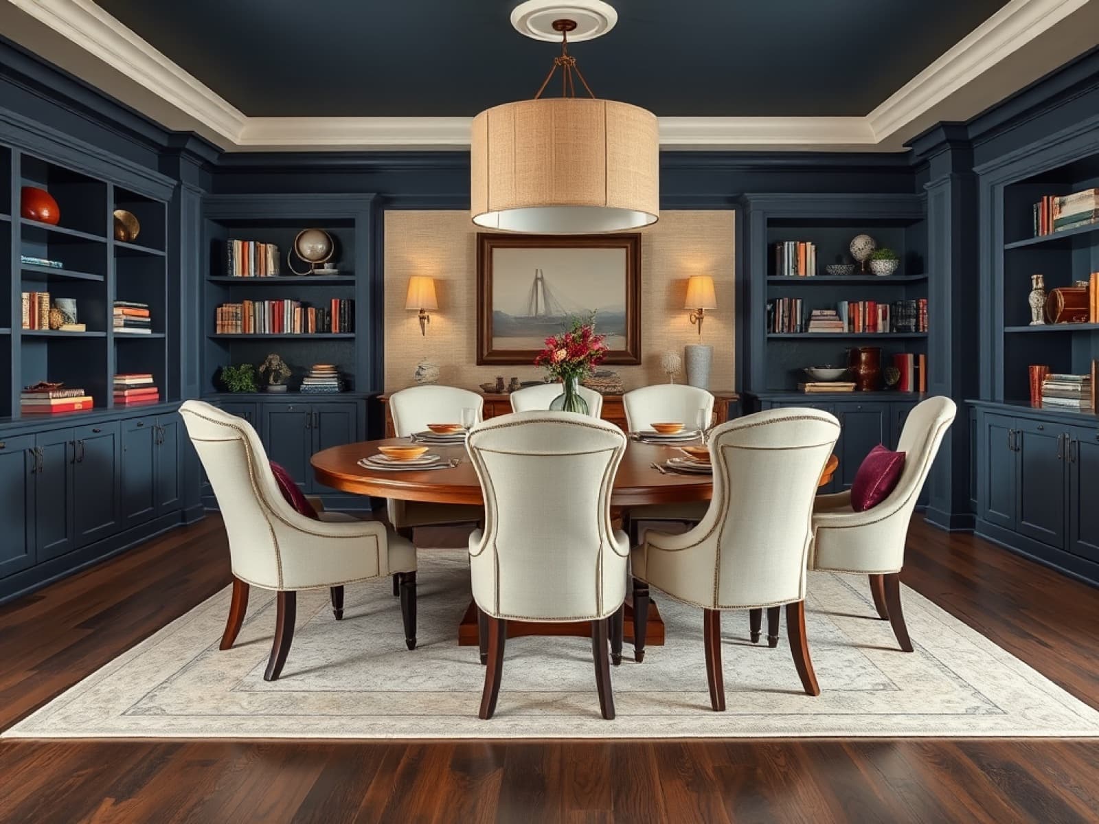
This is Midnight Garden doing what Dunn-Edwards designed it to do: a library-style dining room with deep botanical built-ins, Melodious Ivory walls, and Chardonnay-gold lighting. It's the room you'd photograph for a magazine.
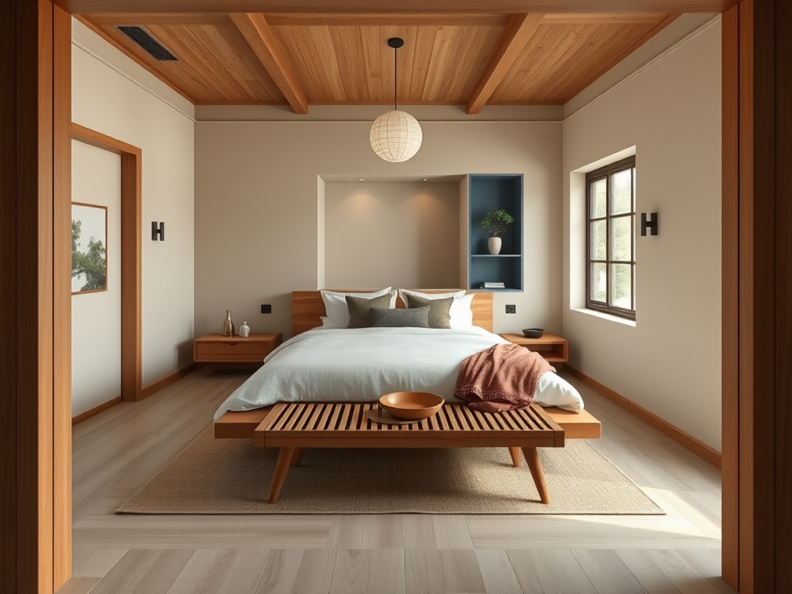
Warm Eucalyptus in a bedroom is the alternative to that all-white "minimalist" look we've been doing since 2019. It's calm without being clinical. Add walnut furniture and ivory bedding and the room finishes itself.
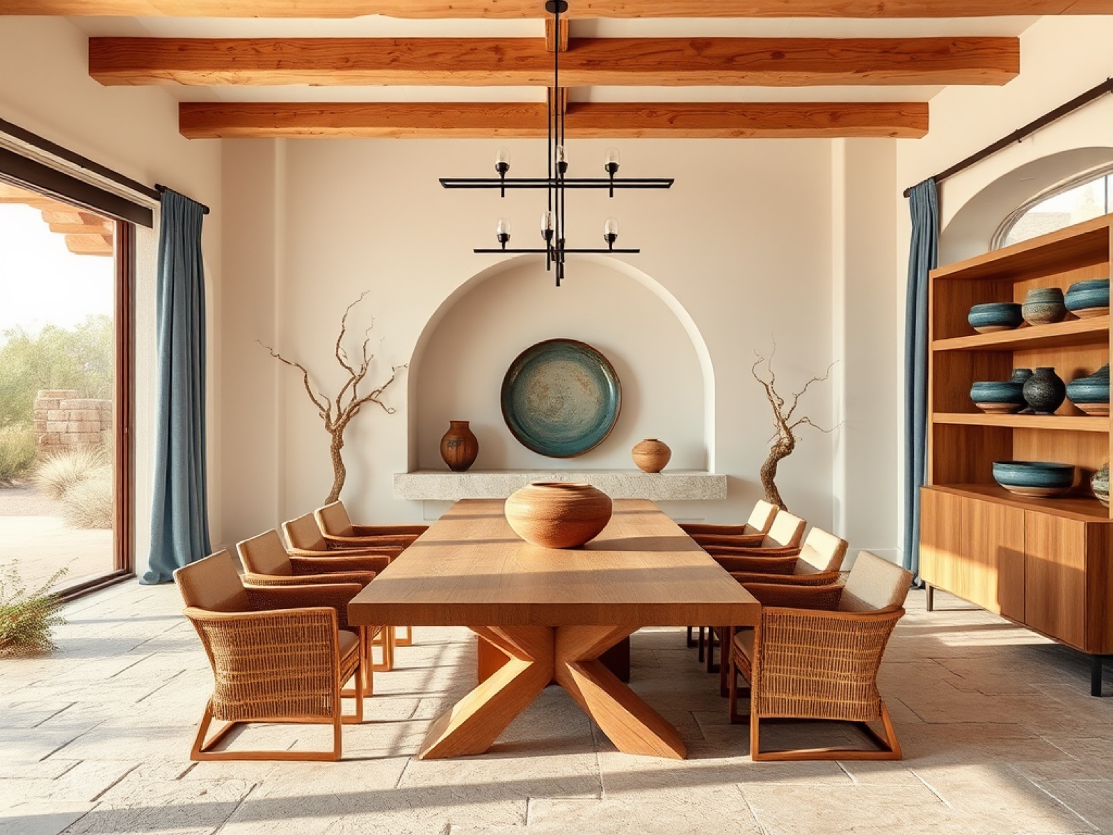
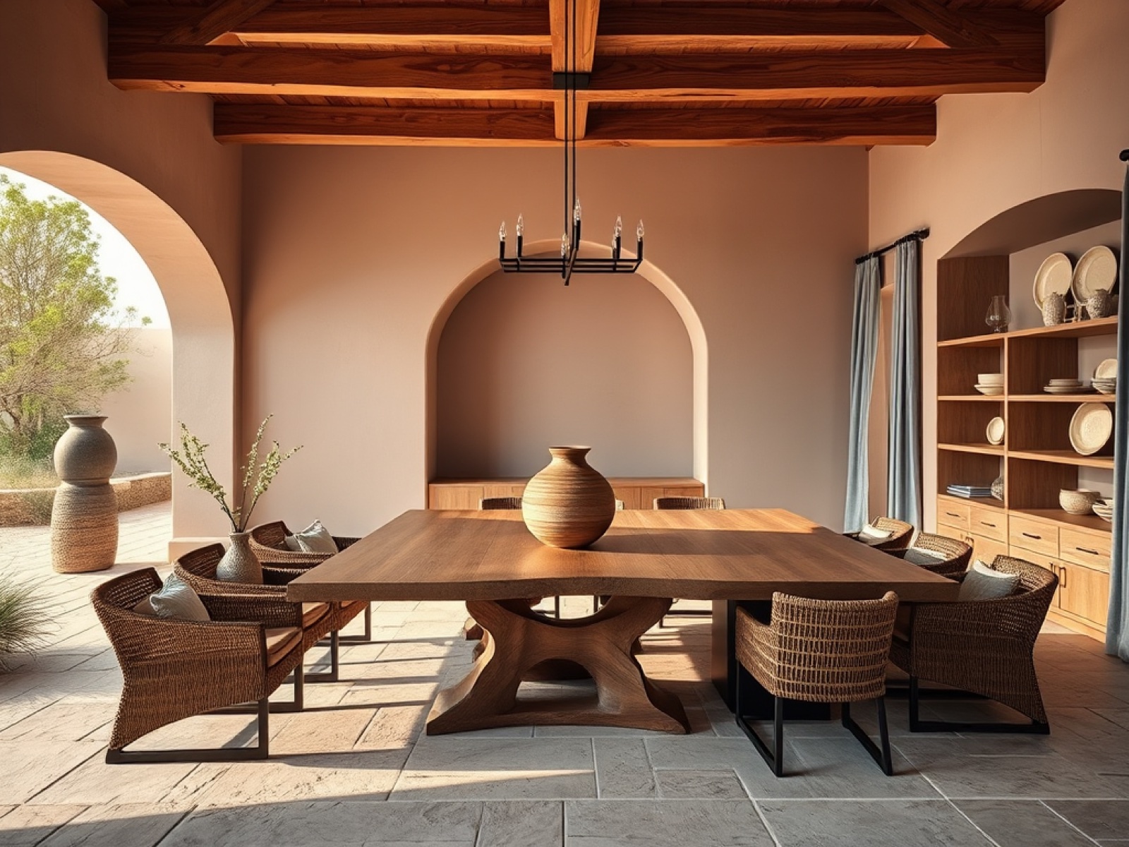
Sonoma Chardonnay is the secret weapon here. It's the warmth this entire palette needs — a sun-baked gold that keeps the greens from going cold. Look at how the natural wood beams pick up on it.
This palette is for you if: You want the most "garden" direction in 2026 — restorative greens, ivory, gold, and one moody plum accent. Reads as both Old World and current, and works especially well in older homes or anything with millwork to highlight.
Palette 4: Sanded Lavender, Celery & Warm Mahogany
The headline: This is the Sherwin-Williams Colormix 2026 family in action — Universal Khaki and Cloud Dancer as the neutrals, with Modern Lavender, Celery, Warm Mahogany, Watery, and Garden Gate rotating in as accents. LUXE Interiors + Design and Architectural Digest both highlight this as the most family-livable direction: grounded layered neutrals with softer color moments.
Sources behind it:
- Sherwin-Williams Colormix 2026 companions to Universal Khaki: Modern Lavender, Celery, Cream and Sugar, Garden Gate, Watery, Henna Shade
- Architectural Digest 2026 color reporting: Universal Khaki, Glidden Warm Mahogany, Pantone Cloud Dancer, Valspar Warm Eucalyptus
- LUXE Interiors + Design 2026 trend reporting: grounded layered neutrals, terracotta/clay, mossy greens, softened blues, warm whites, natural finishes
The colors:
| Color | Hex | Where it lives |
|---|---|---|
| Universal Khaki | #B7A88F | Warm sanded khaki-tan — the grounded wall neutral |
| Cloud Dancer | #F2EFE7 | Soft cloud white — ceilings, trim, plaster, bedding |
| Modern Lavender | #C9BED8 | Misty blue-lavender — adult bedrooms and kids' rooms alike |
| Celery | #B8C995 | Fresh yellow-green — crisp small doses on furniture and tile |
| Warm Mahogany | #7B3F35 | Red-brown depth — vanities, headboards, millwork, dining |
| Watery Blue | #8FB8BE | Fluid pale teal-blue — bathrooms, drapery, art |
| Garden Gate | #4D5F43 | Deep olive green — architectural grounding |
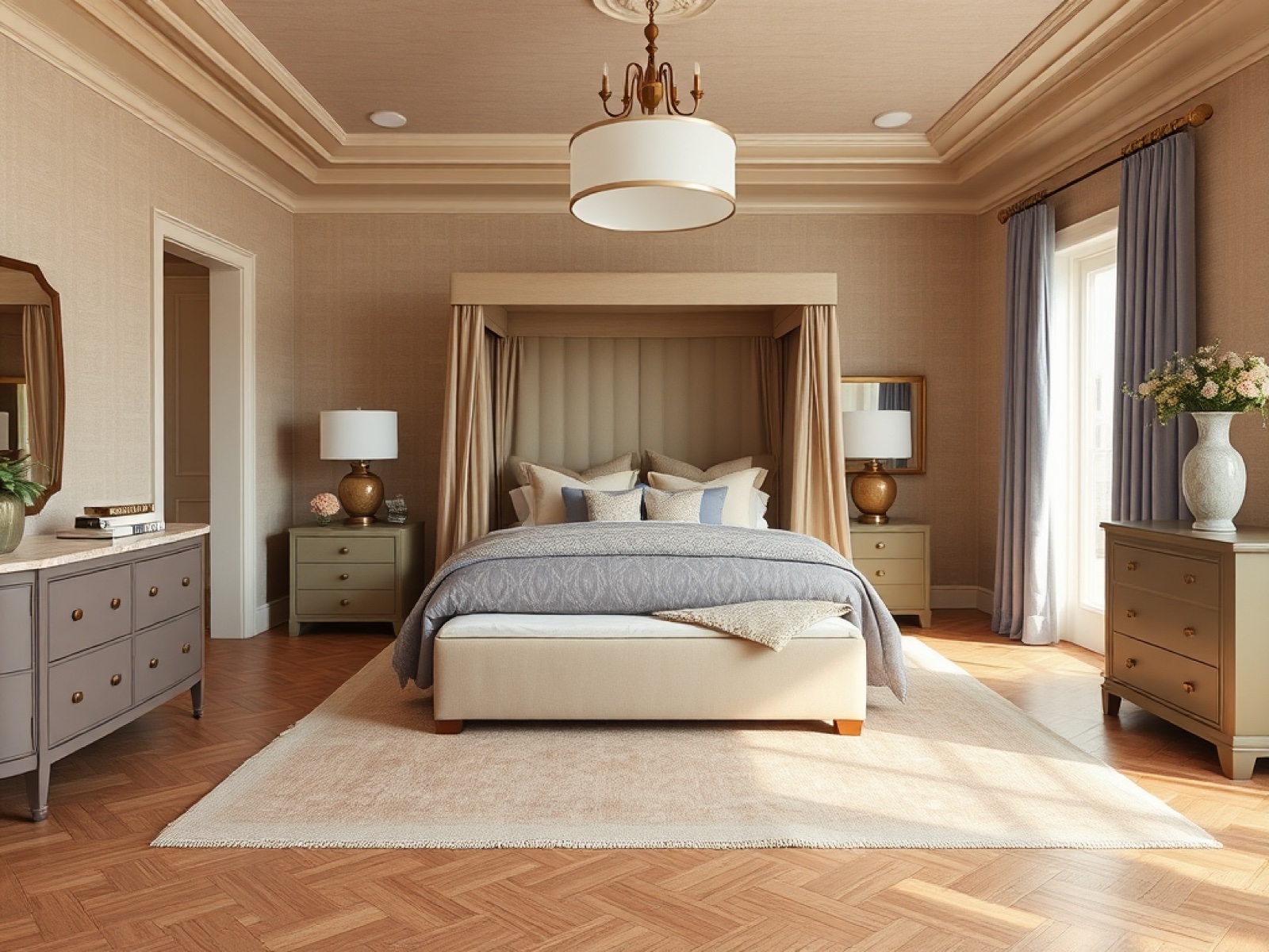
Warm Mahogany is the 2026 alternative to black or charcoal furniture. It carries the same weight without the coldness. Pair it with Universal Khaki grasscloth and Modern Lavender textiles and you get a primary bedroom that feels both rooted and current.
This is Celery as a wall color, paired with a Watery Blue hutch and a Warm Mahogany pendant. The exact yellow-green Vogue and Sherwin-Williams have been pointing to — and proof you can do "fresh and family-friendly" without going back to mint.
Modern Lavender as architecture, not a throw pillow. The plaster arched niche is doing the whole job here — and shows why Sherwin-Williams paired Lavender with Universal Khaki and Garden Gate in Colormix 2026 rather than trying to make it the lead.
This palette is for you if: You want the broadest, most flexible direction in 2026 — usable in every room of the house, with enough accent colors to keep each room distinct. It's the safest "2026 makeover" palette to commit to whole-home, and the easiest to phase in over time.
How to actually try these in your own room
The hard part isn't picking a palette. It's trusting that it'll work in your space before you've taped a single swatch to the wall. A color that looks gorgeous in a Pinterest photo can read totally different in your north-facing dining room with your particular floors and your particular light.
That's where AI visualization changes the math. With Neat Pilot↗, you can upload a photo of any room and paint it with any of these four 2026 palettes in seconds — using your actual walls, your actual furniture, and your actual light.
Here's exactly how to do it:
- Open Neat Pilot at neatpilot.app↗ (or in the mobile app) and create a project for the room you want to redesign.
- Add a photo of the room. Daylight shots work best — the AI uses your existing light to keep the result realistic.
- Open the photo and switch to the Interior Design tab (house icon).
- Paste one of the prompts below into the custom prompt field at the top of the tab.
- Set the Transformation Intensity slider: Subtle keeps more of your existing room and treats the palette as a paint-and-textile refresh; Bold commits fully to the palette as a top-to-bottom redesign. Start at Balanced and adjust based on what you see.
- Tap Transform. You'll see your space reimagined in that palette in about 10–20 seconds. The AI-recommended preset styles below are great too, but the prompts here are tuned for these specific 2026 palettes.
Copy-paste prompts for each palette
Neat Pilot's custom prompt field caps at 200 characters, so each of these is tuned to fit exactly. Paste verbatim.
Palette 1 — Patina Khaki & Damson Hearth
Apply a 2026 Sherwin-Williams Universal Khaki palette: warm sanded khaki walls, creamy ivory trim, smoky plum-burgundy drapery and pillows, aged blue-green ceramic accents, heritage Parisian mood.
Palette 2 — Tailored Umber, Raindance & Soft Pottery
Apply a 2026 Benjamin Moore Silhouette palette: creamy Swiss Coffee walls, burnt-umber millwork, blushed shell pink and Raindance gray-green textiles, one terracotta clay accent, tailored mood.
Palette 3 — Patina Garden, Ivory & Chardonnay
Apply a 2026 Dunn-Edwards Midnight Garden palette: soft ivory walls, deep botanical green built-ins, straw-gold Chardonnay lamps and rugs, dusty rose accents, garden-washed library mood.
Palette 4 — Sanded Lavender, Celery & Warm Mahogany
Apply a 2026 Sherwin-Williams Colormix palette: warm Universal Khaki walls, cloud-white ceiling, misty lavender textiles, fresh celery yellow-green accents, warm mahogany wood tones.
Tips for the best result
- One prompt at a time. Try each palette as a separate makeover so you can compare them side-by-side in your project.
- Use the Transformation Intensity slider. Start at Balanced to see the palette as a full design direction. Dial down to Subtle if you'd rather see a paint-and-textile refresh of your existing layout. Bold is for "show me the whole 2026 redesign."
- Daylight photos read best. If your shot is dim, the AI tends to over-correct. A bright midday photo will give you the clearest preview of how the palette behaves in your space.
- Save the ones you love. Take the AI render into your local paint store as a starting point — then sample the real colors on your real walls before committing.
No more guessing whether Universal Khaki will go yellow in your living room. No more taping eight Benjamin Moore swatches to the wall and squinting at them for a week. Just upload, paste, see, decide.
Try it at neatpilot.app↗ — your first three makeovers are free.
Palette source index
- Sherwin-Williams 2026 Color of the Year & Colormix 2026 — Universal Khaki SW 6150
- Benjamin Moore Color Trends 2026 — Silhouette AF-655 + 9-color palette
- Dunn-Edwards 2026 / A Quiet Joy — Midnight Garden + green-led supporting tones
- HGTV Home by Sherwin-Williams 2026 collection — Griffin, Cordovan, Universal Khaki
- Pantone, Glidden, Graham & Brown, Valspar, Behr, Etsy, Dutch Boy — all referenced in 2026 reporting
- Editorial coverage: Architectural Digest, ELLE Decor, LUXE Interiors + Design, Vogue